
SharePoint Intranet Redesign
UX/UI Design
Overview
I undertook a large-scale redesign of the intranet for a major airline in SharePoint, focusing on enhancing the gateway to employee learning and development. The project followed an detailed UX process, starting with thorough research, user studies, and day tours with various employees, including pilots, cabin crew, and ground staff. By gathering insights into user needs and daily workflows, I developed user personas and journey maps to guide the design and complete a user friendly experience.
- Audience: Airline Employees
- Responsibilities: User Experience (UX), User Interaction, Instructional Design, Coding, Interactive Design
- Tools Used: CSS, HTML, Figma, SharePoint
Problem and Solution
The airline’s existing intranet, built on the classic SharePoint framework, limiting design choices for developers and a bland user experience. Employees had to navigate through multiple clicks to access their learning and development resources, making the process time-consuming and frustrating. Overall, the classic intranet was not user-friendly and hindered engagement with training materials. Another issue was lack of catergories and confusion within the site map, creating more confusion on its purpose.
To address these issues, we undertook a complete redesign of the intranet using CSS and HTML, with assistance from our design team. The key to this redesign was to create a more intuitive and visually appealing interface that sent users directly to their materials. We not only made it more visually appealing within the airlines design standards but was able to work with our external partners for workarounds on our “one-click” campagin that aimed for users to click no more than once to be redirected.
My Process
User Research
User Studies
Interview employees to identify pain points and journey map
Surveys
Surveyed leaders and nonleaders for differentiated feedback

Shadowing
Shadow employees on the job to understand time constraints
User Feedback
Used feedback recieved over the last year to create objectives
WireFraming
Using data gathered from our research, we began hard sketches of the new layout. We began with paper sketches to combine ideas before placing them on a whiteboard to structure our designs. We refer to our user personas and continue revisions based on user stories. We discussed external software and technology that may need to be implemented to assist in the design phase and final roll-outs.
The user stories were the focus of our wireframes as we reviewed because it allowed an empathetic approach to our UX process. With the research we gathered, we were able to accurately represent users in different sectors of the airline.
For example, Lola is a 32 year old front desk representative. Her responsibilities involve speaking with customers daily and checking them in for boarding. Even though her hours vary, being in customer service is stressful. With a two year old and five year old at home, the thought of taking trainings to elevate her to a leadership position doesn’t seem doable.
With that, we can approach this design from and “ease-of-access” standpoint.
Sketching Out Ideas
Creating rough sketches
Discussion
Continous brainstorming and referring to user research
Review
Reviewing old layout and discussing changes before official wireframing
Design
The airline’s existing intranet, built on the classic SharePoint framework, limiting design choices for developers and a bland user experience. Employees had to navigate through multiple clicks to access their learning and development resources, making the process time-consuming and frustrating. Overall, the classic intranet was not user-friendly and hindered engagement with training materials. Another issue was lack of catergories and confusion within the site map, creating more confusion on its purpose.
To address these issues, we undertook a complete redesign of the intranet using CSS and HTML, with assistance from our design team. The key to this redesign was to create a more intuitive and visually appealing interface that sent users directly to their materials. We not only made it more visually appealing within the airlines design standards but was able to work with our external partners for workarounds on our “one-click” campagin that aimed for users to click no more than once to be redirected.
Layout
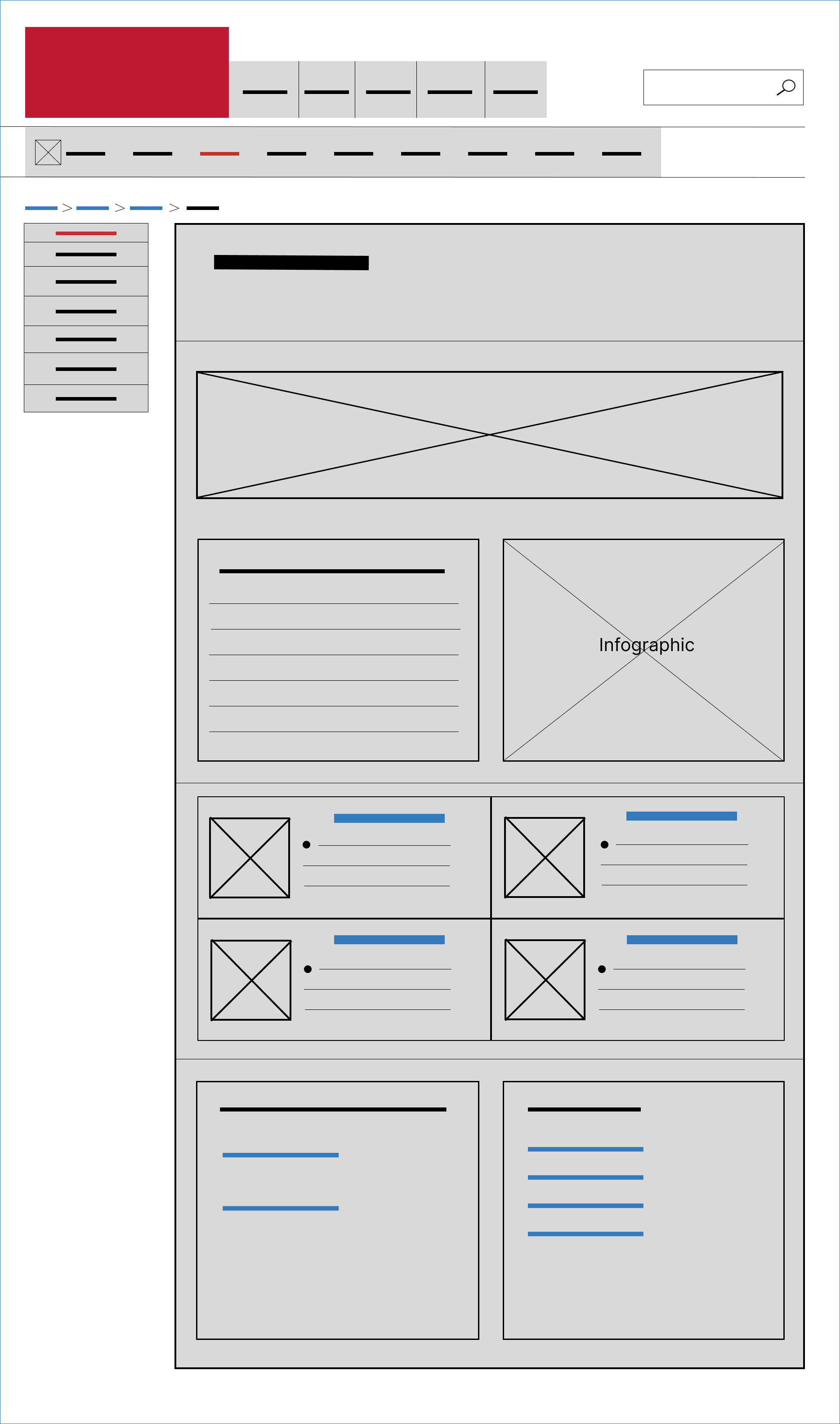
Keeping a uniform design, we aimed to maintain consistent navigation structures and styles across all pages. Also, feeding familiar navigation patterns that users recognize, such as top navigation bars, side menus, and breadcrumb trails.
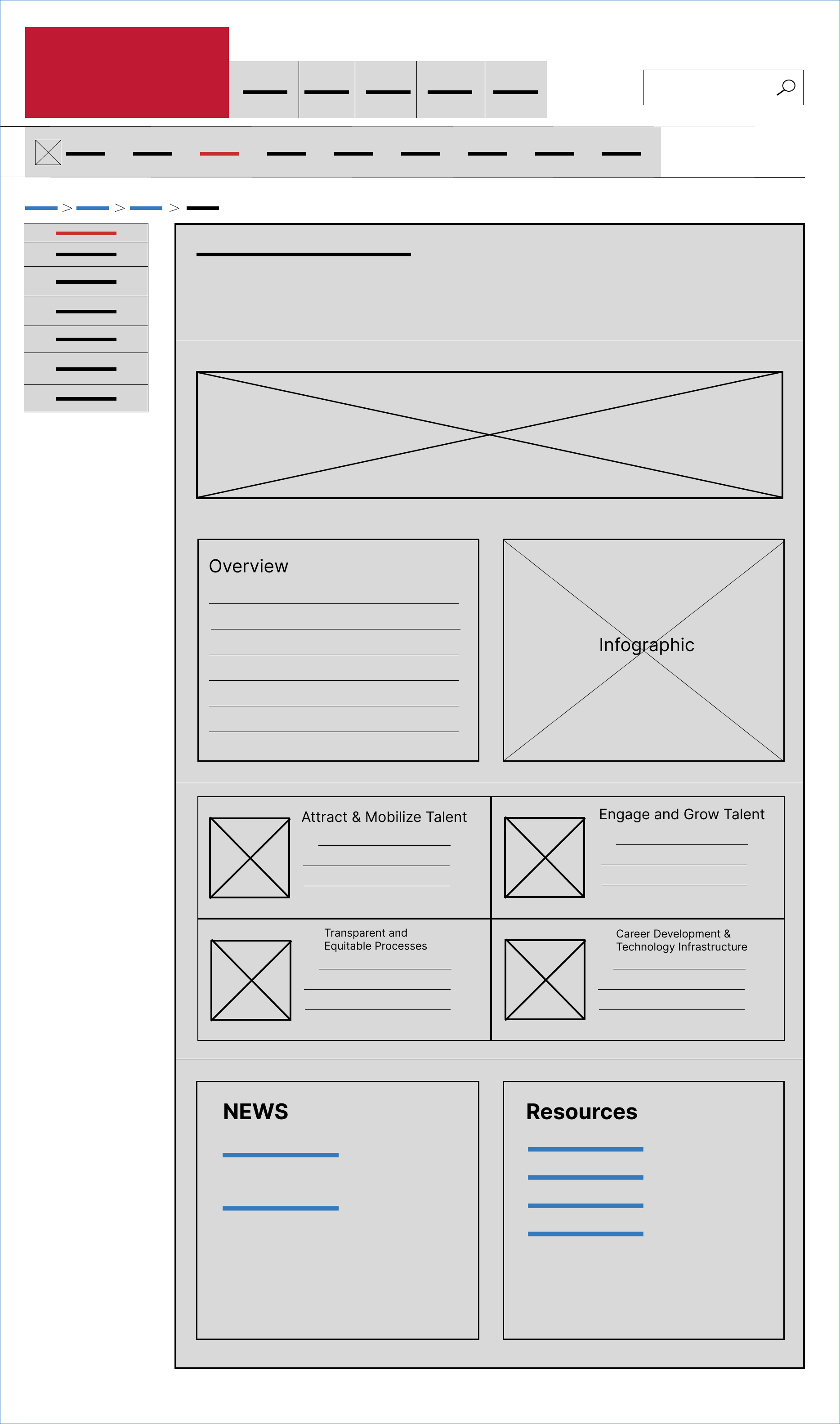
Navigation
We focused on design navigation to minimize the number of clicks needed to reach important content, reducing user effort and frustration. This was a major painpoint in the redesign that was adressed first.
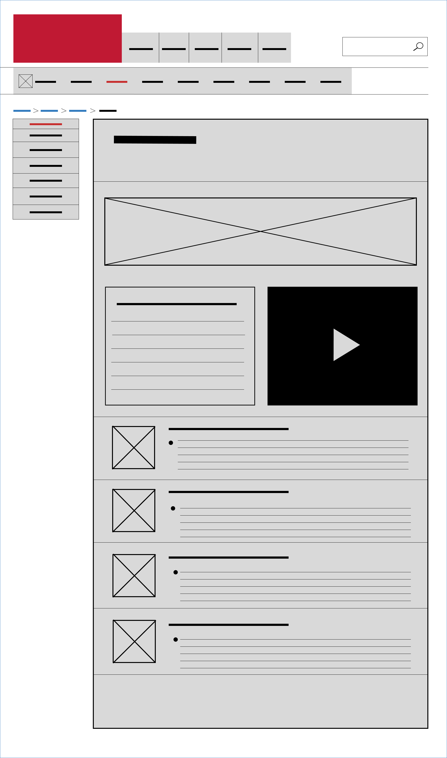
Accessibility
Another important feature were navigation menus that were easily accessible, either through persistent display or intuitive icons that expand on click or hover. Any media added within the pages were to have all accesible features such as closed captions (cc) and alt text.
Prototyping and Testing
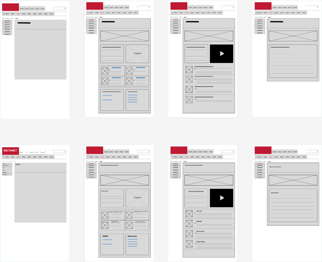
During the wireframing phase, we conducted Alpha and Beta reviews that included all stakeholders. Once all wireframes, site maps, and architecture were approved, we moved on to prototyping and testing. Prototyping took place in Figma, where I built out each page, action, and transition. This allowed me to provide a live preview before the buildout in SharePoint.
The blocks on the left were part of the wireframing process and were brought into testing after links, image stills, and text were added for clarity. Testing was extended to multiple airline employees within HR to review for design, clarity, simplicity, and accessibility.
Using the feedback given, we made further revisions to ensure the best possible design. When it came to testing, we had two stages. Collaborators in Figma had the opportunity to see basic functions before the buildout in SharePoint. This made it easier for stakeholders to identify broader issues.
After testing in Figma was completed, I was tasked with building out our full product in SharePoint. The restrictions and constraints I faced included limited access to all SharePoint functions, as the airline had a department specific to page buildouts. I was able to request access and begin the buildout.
Another issue I encountered was the simplicity of SharePoint’s blocks, layouts, and codes. To address this, I obtained the proper permissions and teamed up with our Corporate Communications team to create a design as close as possible to our prototypes.
It is important to note that the airline has branding and design standards that had to be followed and approved. This extended the process due to a backlog of requests from Corporate Communications. Nevertheless, we successfully completed the buildout a week before publishing, which allowed us to conduct more walkthroughs with stakeholders. For these walkthroughs, I held Teams meetings, shared my screen, and facilitated a tour and “how-to” of our new intranet.